
A clear glossary of essential design terms to help you understand creative language, review work and give better feedback.
October 4, 2024
Design has its own language. When you are reviewing a website, brand identity, campaign or printed piece, the terminology can sometimes make simple conversations feel more complicated than they need to be.
This glossary explains essential design terms clearly, so you can understand the thinking behind the work and make better decisions with your creative team.
Use it as a quick reference when you are giving feedback, reviewing a proposal or trying to understand how a design choice affects your brand.
Essential design glossary terms
Accessibility
Accessibility means designing so people with different needs, abilities and devices can use the experience. In digital work, it affects areas such as colour contrast, text size, keyboard navigation, clear content and usable interface patterns.
Alignment
Alignment is the positioning of elements in relation to each other. Strong alignment makes a design feel organised, intentional and easier to scan.
Balance
Balance is the way visual weight is distributed across a design. It can be symmetrical, where elements mirror each other, or asymmetrical, where different elements still feel stable and considered.
Baseline
A baseline is the invisible line that text sits on. It helps keep letters aligned and supports consistent spacing in typography.
Bleed
Bleed is the extra artwork area that extends beyond the final trim edge in print. It prevents unwanted white edges when printed pieces are cut to size.
Brand guidelines
Brand guidelines are rules and standards for how a brand should appear and sound. They usually cover logos, colours, typography, imagery, tone of voice and usage examples.
Brand identity
Brand identity is the collection of visual and verbal elements that make a brand recognisable. This can include logos, colours, type, imagery, layout style, messaging and personality.
Composition
Composition is the arrangement of elements within a design. It controls how type, images, colour, space and graphics work together as a whole.
Crop
Cropping means trimming an image to change the framing, remove distractions or focus attention on the most important part of the visual.
CTA
CTA stands for call to action. It is the prompt that asks someone to take the next step, such as contacting a team, booking a call, downloading a guide or reading another page.
Folio
A folio, or portfolio, is a collection of design work used to show experience, style and capability. It helps clients and employers understand the kind of work a designer or agency can produce.
Grid system
A grid system is a structure used to organise content and align elements. It helps create consistency, spacing and order across pages, screens or printed layouts.
Hero image
A hero image is a large, prominent visual near the top of a page. It helps set the tone, introduce the subject and create a strong first impression.
Hierarchy
Hierarchy is the order of importance in a design. Size, colour, contrast, spacing and placement all help guide the viewer towards what matters most first.
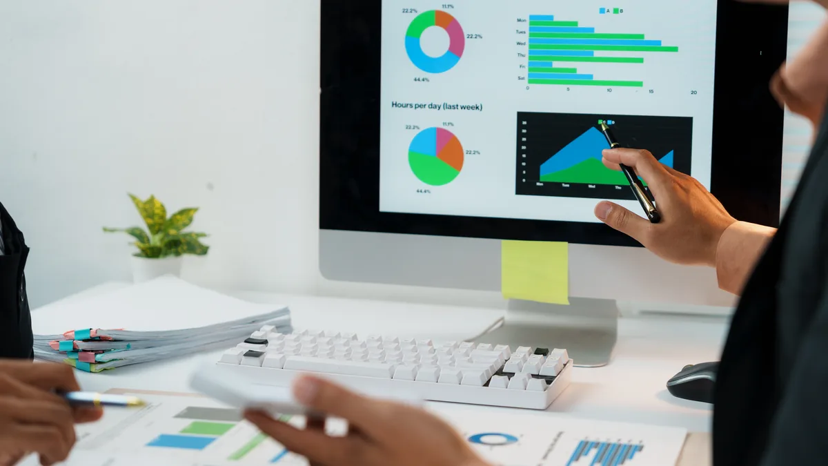
Infographic
An infographic is a visual explanation of information, data or a process. It uses design to make complex or detailed information easier to understand quickly.
Iterative design
Iterative design is a process of improving work through repeated rounds of testing, feedback and refinement. It helps ideas become stronger before they are finalised.
Mock-up
A mock-up is a visual representation of how a design could look in context. It might show a website page, packaging, signage, advert or branded item before final production.
Mood board
A mood board is a collection of images, colours, textures, typography and references that helps define the visual direction for a project.
Negative space
Negative space is the empty or quieter area around design elements. It helps create focus, balance and breathing room.
Pixel perfect
Pixel perfect describes a design or build where elements are aligned and rendered with precise detail. It is often used when comparing a built interface against an approved design.
Pixels
Pixels are the tiny units that make up digital images and screens. More pixels can mean more detail, but image quality also depends on resolution, compression and display size.
Prototype
A prototype is an early model of a product, page or interaction. It helps teams test ideas, understand flow and gather feedback before final design or development.
Responsive design
Responsive design allows a website or interface to adapt to different screen sizes. A good responsive design works clearly across mobiles, tablets, laptops and larger displays.
Scalability
Scalability is the ability of a design system, layout or asset to work across different sizes, channels or future needs without losing quality or clarity.
Stock image
A stock image is a pre-existing photograph, illustration or graphic that can be licensed for use. Stock imagery can be useful, but it needs careful selection so it does not feel generic.
Storyboard
A storyboard is a sequence of panels used to plan a journey, animation, video or interaction. It helps show what happens over time before production begins.
Trim
Trim is the final size of a printed item after it has been cut. Designers need to consider trim, bleed and safe zones so printed work finishes cleanly.
UX
UX stands for user experience. It describes how someone feels and behaves when using a product, website or service, including how easy, useful and satisfying the experience is.
UI
UI stands for user interface. It covers the visible and interactive parts of a digital product, such as buttons, forms, navigation, icons, layout and on-screen states.
White space
White space is the empty space around design elements, regardless of the actual background colour. It helps reduce clutter, improve readability and guide attention.
Wireframe
A wireframe is a simple structural plan for a webpage, app or interface. It focuses on layout, content order and functionality before visual design details are added.
More design glossary terms
If you found this useful, you may also want to read our related design glossary posts.
On the hunt for a good agency?
Get in contact with us today to see how Weird Wolf Agency can help you, we will be listening out for your howl...